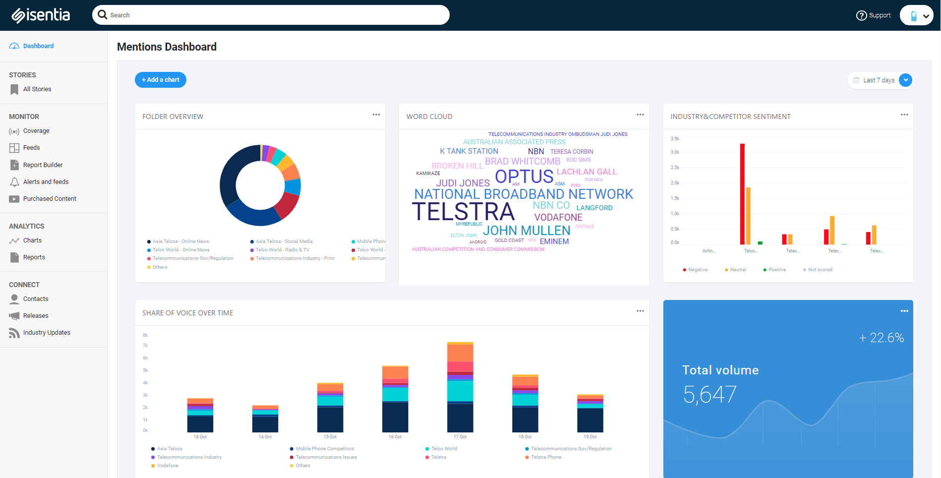
 The Analytics Dashboard is available in your Mediaportal to improve the way your coverage is visualised. The feature includes new chart templates such as sentiment analysis, word cloud, and top voices in the media. We have also added new chart download formats (CSV, SVG and PNG) for more flexibility when reporting or presenting your coverage, customisable layout options, and PDF and web hosted report outputs so that you can easily share key insights with your business.
This article is a detailed guide to setting up your new Dashboard.
Contents
- Dashboard Cheat Sheets
- Accessing the Analytics Dashboard
- Creating additional Dashboards
- Customising your Dashboard title
- Creating charts
- Adding a Feed to your dashboard
- Full screen mode
- Changing the date range
- Customizing your chart title
- Other chart actions
- Deleting a chart
- Building a PDF chart report
- Exporting a chart
- Changing the chart width
- Automated Commentary
- Dashboard Reports
Dashboard Cheat Sheets
Use these Cheat Sheets for a quick setup guide:
Accessing the Analytics Dashboard
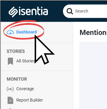
The Dashboard appears as a new tab in the left-hand navigation panel. Clicking on this tab will take you to the Dashboard page.
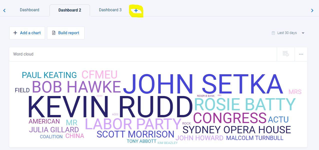
Creating additional Dashboards
Depending on your user subscription level, you may have access to create additional dashboards. The default is the single dashboard, but by clicking on the + tab, you can add additional dashboards.
![]()
Customising your Dashboard title
You will notice that the Dashboards will include a generic title at the top of the dashboard. This title can be customized by clicking on it, deleting the generic text, and then typing in your new title. Note -please click the on the tick symbol to save the new name.
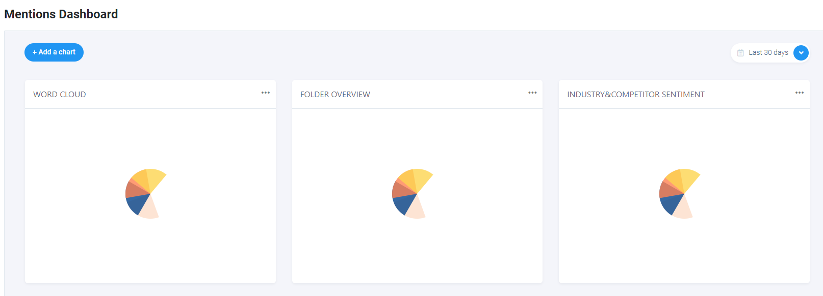
Creating charts
If you haven’t already setup a chart, you will see three default charts available all for your briefs.
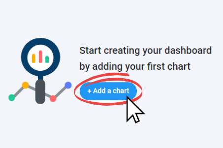
Alternatively you may be prompted to create your first one.
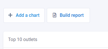
If you already have a chart on your dashboard, you can create additional charts by selecting the “Add a chart” button above your first chart.
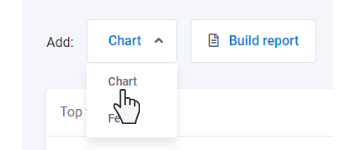
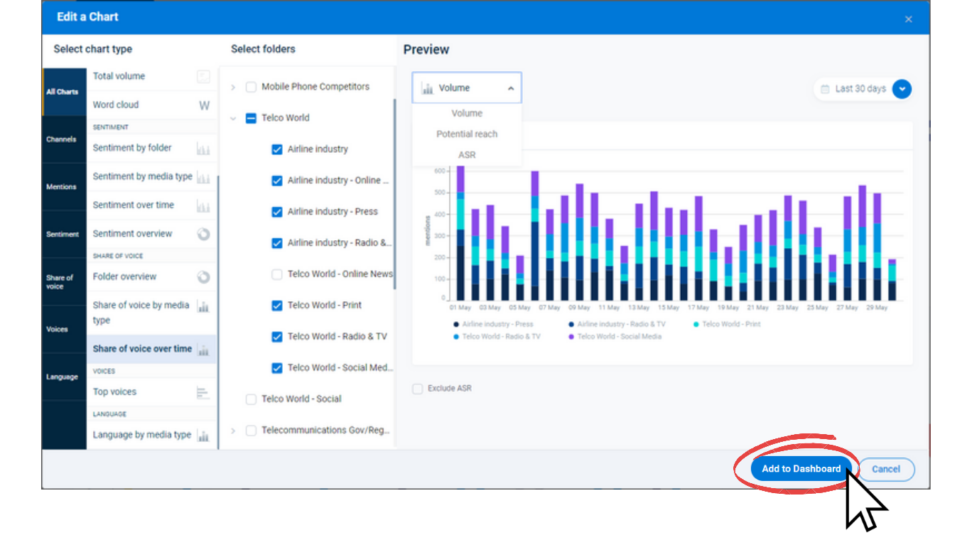
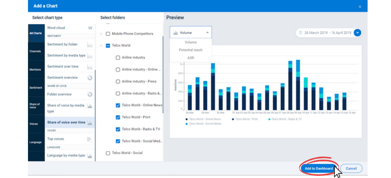
Clicking “Add a chart” in either of the above areas will open the builder window where you can start creating a chart. The first option in the chart builder is to select the chart template that you would like to use. These can be seen under the “Select chart type” heading.
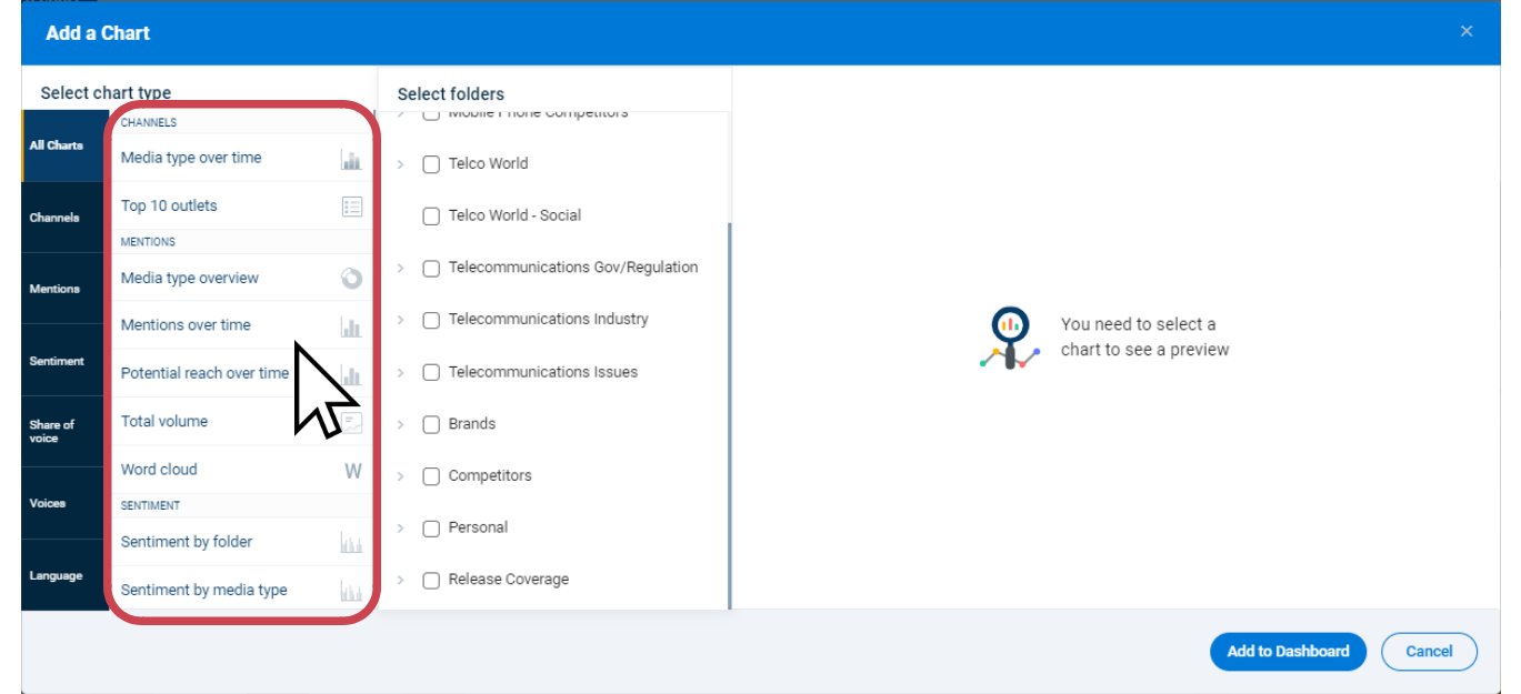
There are 14 different chart types to choose from, each providing a different view of your coverage. If you would like to filter the chart type list to show only certain types of chart templates, you can do so by selecting one of the chart type categories in the blue panel on the left. For example, if I only want to see chart types that will help me compare coverage different sources of coverage, I can select the “Share of voice” category.
For a detailed explanation of each chart type, you may like to view this chart template guide.
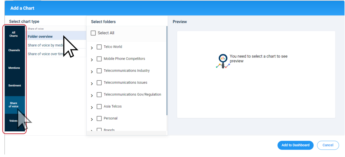
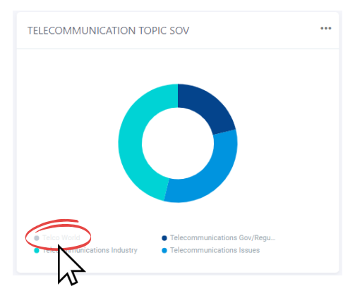
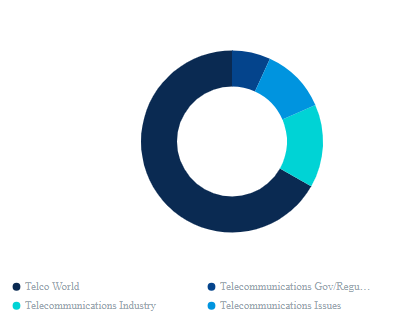
Once a chart type has been chosen, the “Select folders” column will now be clickable allowing you to pick the briefs or folders you would like to analyse. From the list, you will have the option to select either parent or sub briefs/folders. When using folder breakdown charts, if you tick the box next to a brief/folder, the name will appear as a section on the chart.
To included sub briefs/folders, expand the brief/folder set using the drop-down arrow and tick the box next to each sub brief/folder individually. You will see the sub names appear on the chart preview.
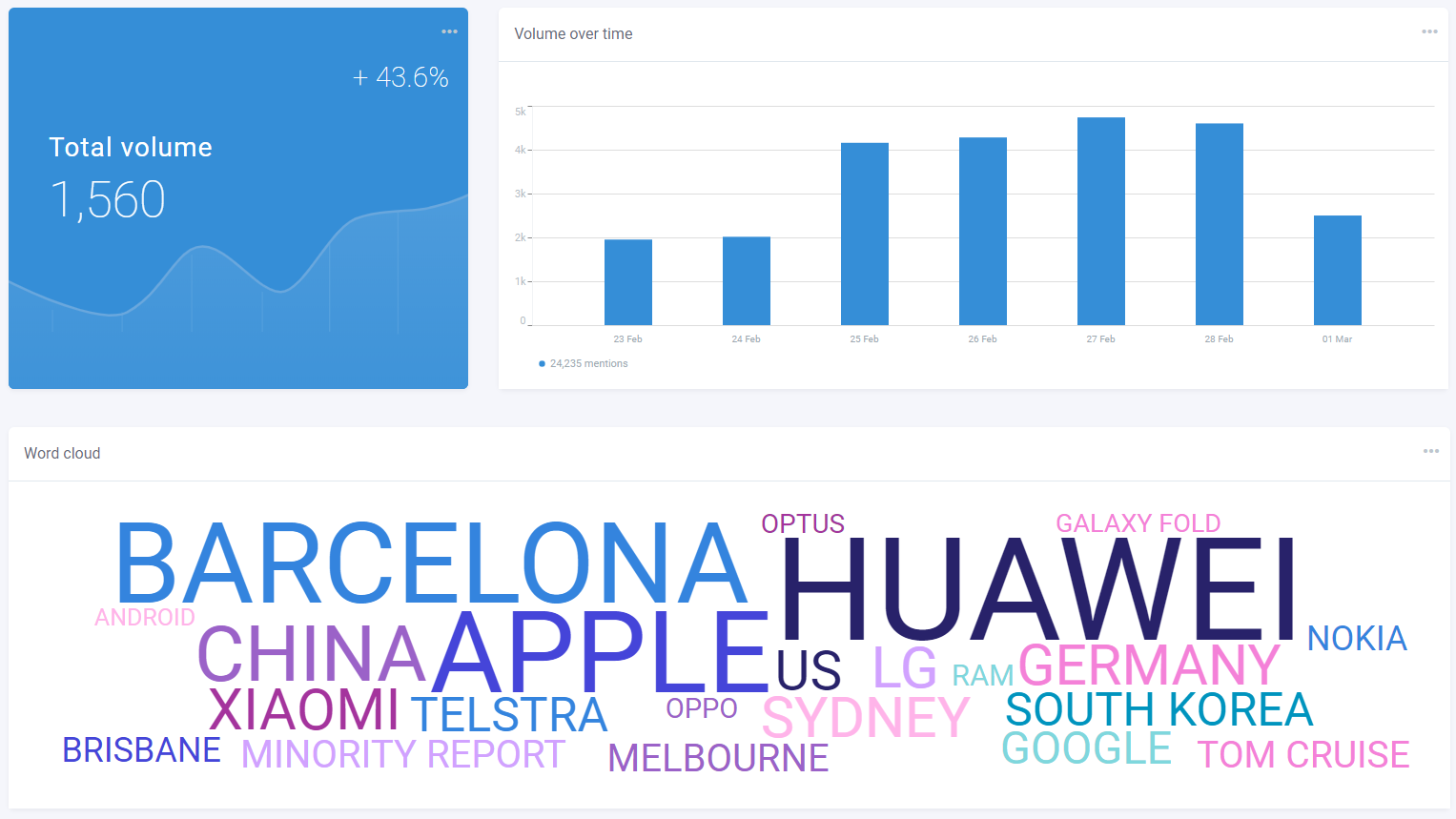
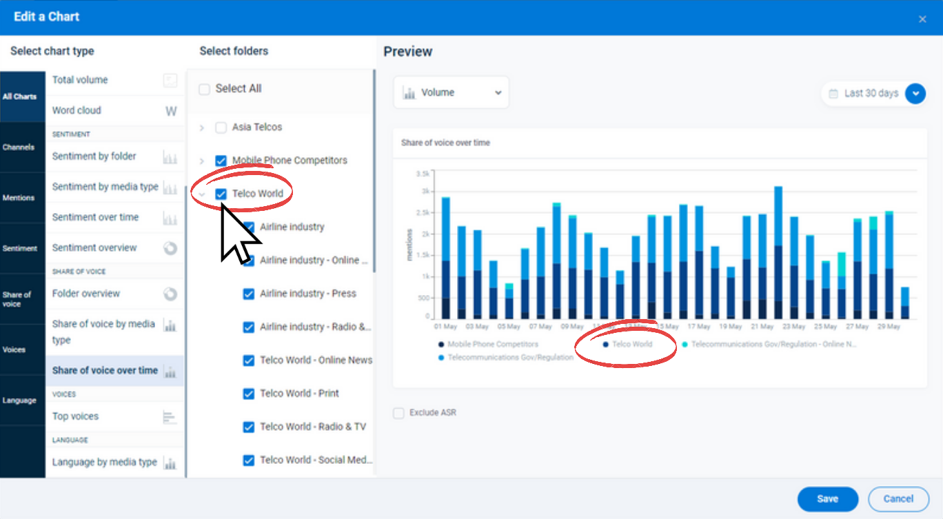
Above the chart preview you will see a drop down tool allowing you to choose data metrics to analyse. Depending on the chart type chosen there will be three different options to choose from: Volume, Potential reach (Audience) and ASR (Advertising Space Rate). All data comes from each media item in the brief/s or folder/s you have selected within the date range set on the Dashboard page. The metrics are as follows:
- The volume data set analyses the number of media items available.
- The Potential reach data set analyses the audience values. (For potential reach data we use different figures for each media type. For Broadcast content we use the total Audience figure. Print content uses circulation figures, and for Online media, we use the Average Story Audience).
- The ASR data set analyses the Advertising Space Rate totals (where available). These can be toggled by simply clicking on the data set you would like to use.
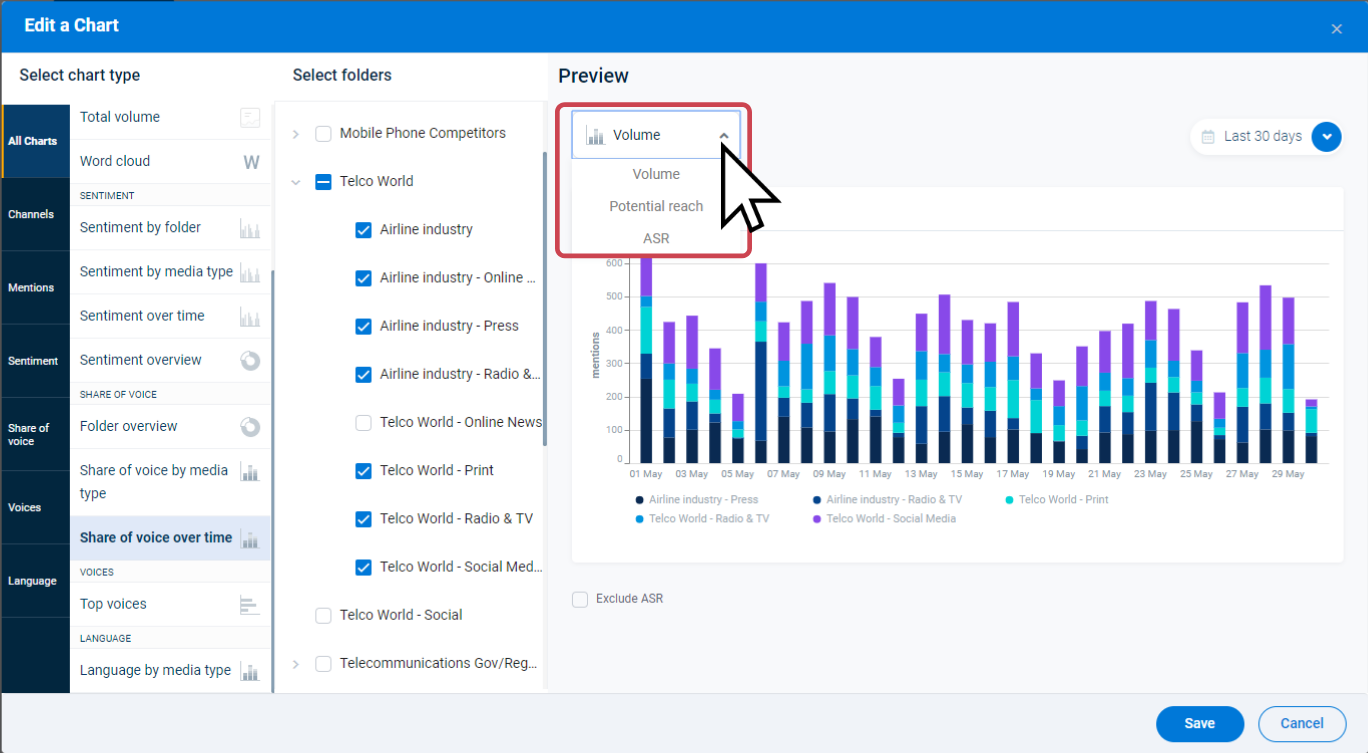
If you wish to hide ASR values from all this chart in all area’s of the dashboard, you can use the “Exclude ASR” toggle below the chart preview.
Once you are happy with the chart, select the Add to Dashboard button.
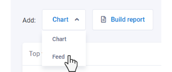
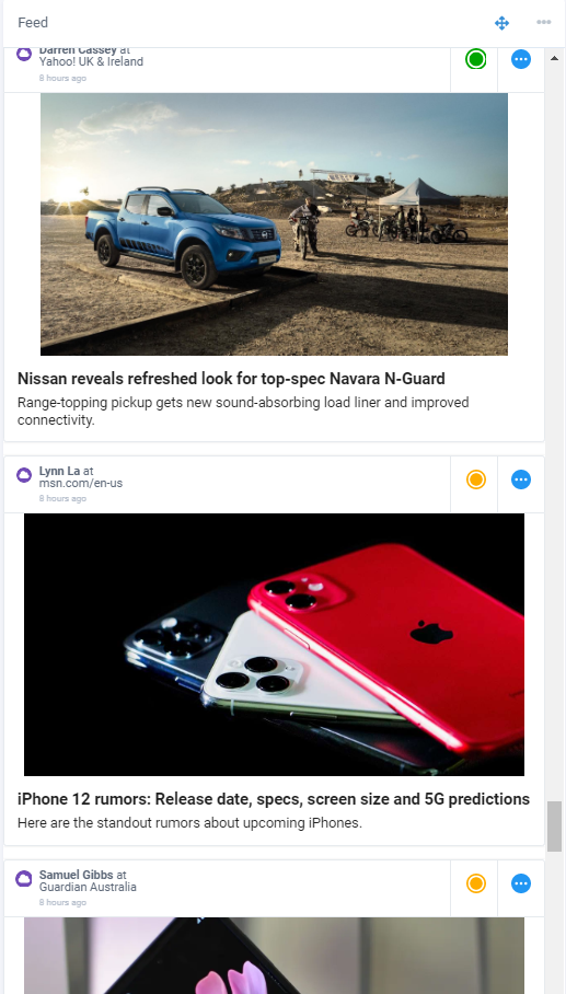
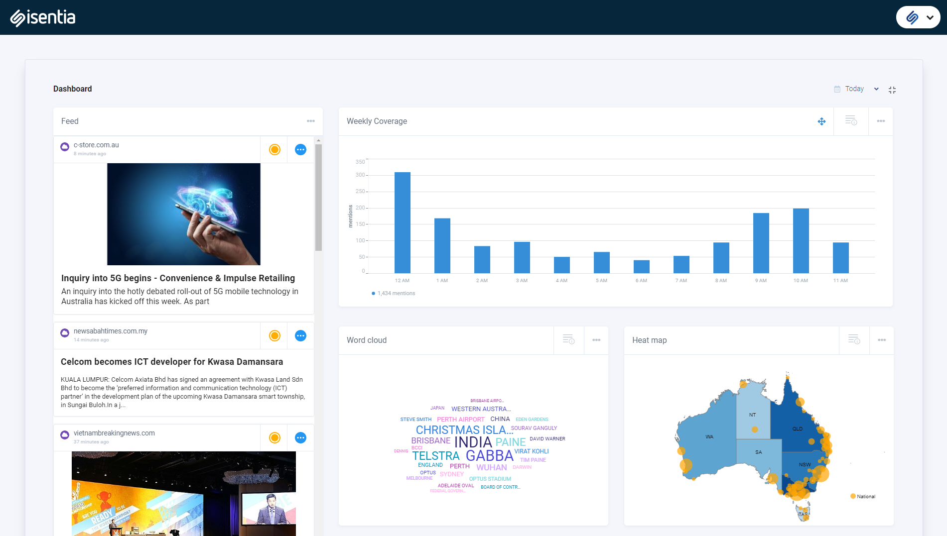
Adding a Feed to your dashboard
If you have access to Feeds in Mediportal, the dashboard will include the ability to add up to one Feed per dashboard page, allowing you to view media content and charts in one place. To add a Feed, click on the add drop-down, then select “Feed”.
The Feed configuration window will open on your dashboard where you can select the options for what media content you want to see. For media items to appear, you will need to apply at least one of the following filters: “Containing keyword(s)”, “From briefs or folders”, “Sentiment”, “Media types”, “Geographic regions”, “Media outlets”, or “By media contacts”.
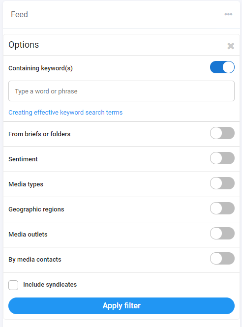
For more specific results, use a combination of filters.
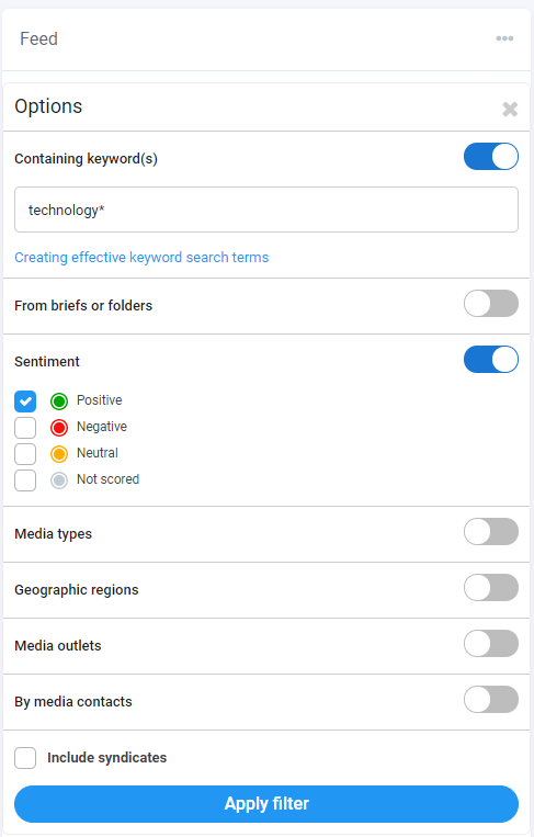
Syndicated article handling can be controlled using the checkbox at the bottom of the Feeds settings panel. By default, the checkbox will be ticked meaning syndicated media items will show in the Feed panel. Deselect this option to hide syndications.
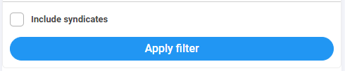
Once you are happy with your selected options, click “Apply filter” to add the Feed to your dashboard.
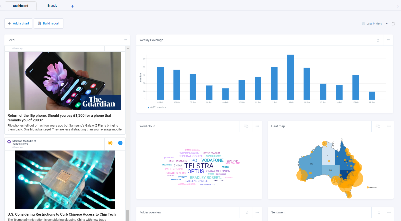
Regardless of the chosen date range on your dashboard, your Feed will always display all content available in your Mediaportal matching the criteria you select. Content will be displayed in order of newest to oldest, and scrolling down your Feed column will load older data into the column. Up to 12 months of matching content can be accesses from the Feed. For more information about Feeds, check out the How to: Feeds article.
Up to 9 charts and 1 Feed can be added to your Dashboard at a time. Once you have reached this limit, you will need to delete or edit existing charts in order to add new ones.
[/groups_member]
Up to 9 charts can be added to your Dashboard at a time. Once you have reached this limit, you will need to delete or edit existing charts in order to add new ones.
Alternatively you can click on the + sign to add additional Dashboard tabs, and start adding extra charts. Each dashboard, can contain up to 9 charts.
Full screen mode
For a clearer view of your dashboard, enable full screen mode using the button at the top right side of the page next to the date selector.

Enabling full screen mode will hide Mediaportal’s left navigation panel, your browser tool bar, the Mediaportal Search bar, the add a chart and build report buttons, and your other dashboard tabs. Press escape (Esc) on your keyboard or click the full screen button again to change back to the regular dashboard view.
Changing the date range
All charts on your dashboards will analyse content in the briefs or folders connected to them based on the date range set at the top right corner of the page.
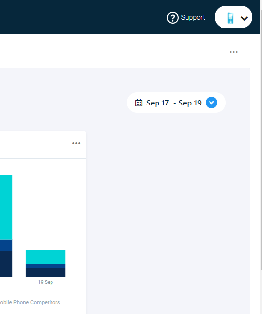
The date range can be changed by clicking on the date drop-down. First, you will need to select whether you want to use “Delivered” or “Aired/Published” dates for your coverage data. Next select either the “Custom Range” and pick dates from the calendar, or click on one of the quick-select dates (Live, Last 2, 3, 7, 14, or 30 days.)
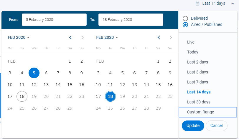
Selecting a new date range will update all charts on your Dashboards, loading the data from the time period selected.
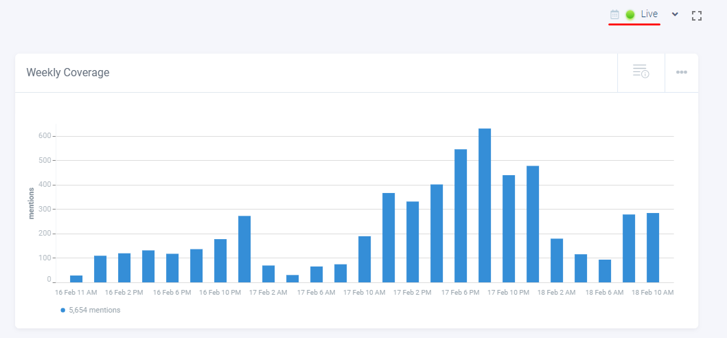
The “Live” date range option will display data from the past 3 days, and will also automatically refresh your dashboard so that the latest data is always displayed.
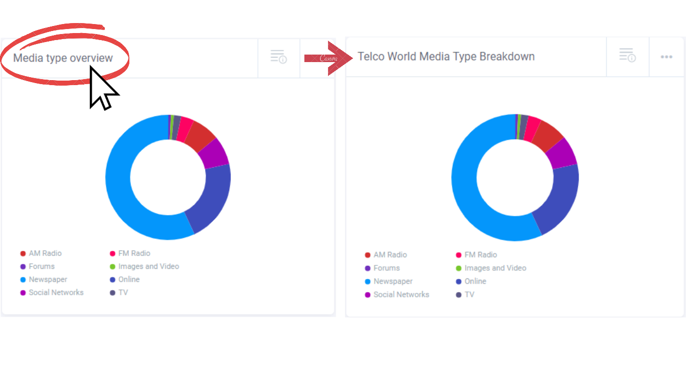
Customizing your chart title
You will notice that all charts on the Dashboards will include a generic chart title at the top of the chart. This title can be customized by clicking on it, deleting the generic text, and then typing in your new title. There is a limit of 40 characters for the titles of any of the charts.
Other chart actions
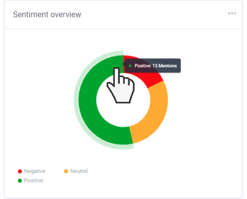
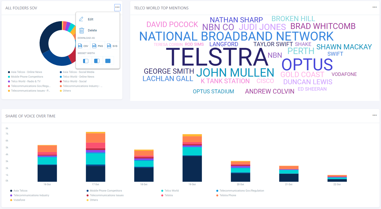
In the builder window or on your Dashboards, you can hide sections of a chart by clicking the labels in the legend. Once clicked, the label will turn grey, and the corresponding section on the chart image will be hidden. Click on any blank space of the chart image or the label again to show the section.
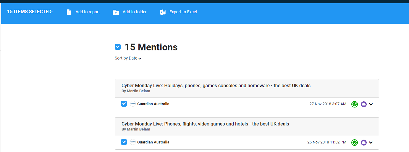
If you would like to view the media items that form a section of a chart, you can click on the section to view the content list.
Note: On some charts, that compare multiple briefs or personal folders, you may notice a segment in the chart titled “others”. This is due to the fact that you are allowed a maximum of ten segments on one chart so the Dashboard will automatically group the smallest remaining folders together under this “others” segment.
From here you will have the options to add items to the report builder, a personal folder, or export them to excel.
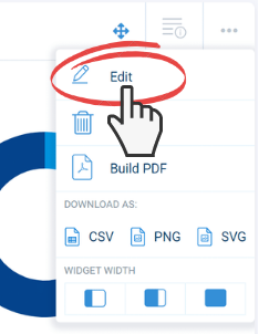
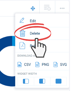
To make changes to a chart that you have created, you can edit the chart by clicking on the ellipses at the top right corner of the tile and clicking on the “Edit” button.
This will open the chart builder window where you can view the current chart settings and adjust them. If you make any changes, select “Save” to apply them.
Deleting a chart
There are also a couple of other action tools under the ellipses on a chart: delete, download as, and widget width. If you would like to remove a chart from your dashboard, you can do so by using this delete button. There is a limit to the number of charts that can be saved to the Dashboard at one time. Once you have reached the limit, you will need to delete one using this button if you would like to add others. Alternatively, you can edit a chart to replace it with another one.
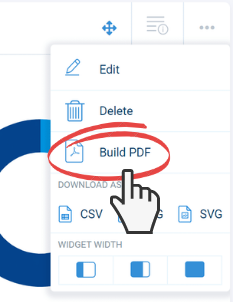
Building a PDF chart report
Under the ellipses on each chart there is also an option to build an individual PDF chart report. This PDF report format will include the chart image, and the option to include up to 1000 of the media items being analysed, which will appear below the chart. When building a chart report that is analysing more than 1000 items, only the most recent 1000 media items (by date range option selected) will be displayed in the PDF.
This will take you through to the PDF report builder page where you can customise the look and feel of your report and choose what information you would like to include.
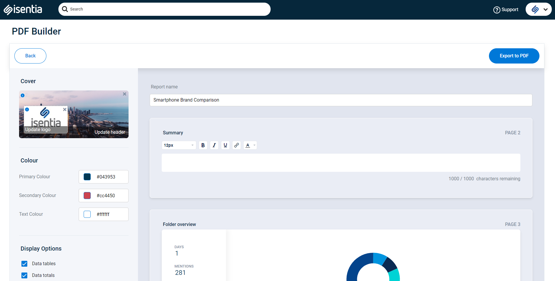
Start by adding a title for your report and an executive summary.
Brand you report by applying theme colours and uploading a cover and logo image. These will appear on the first full page of your report.
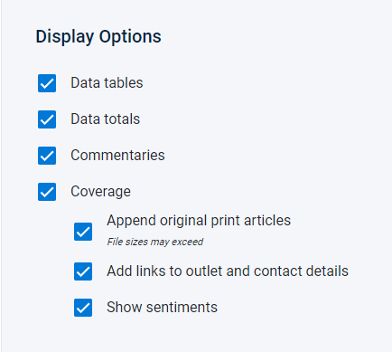
On the left hand side of the page you will see the display options section where you can choose what information you would like included in you report. Data options are:
- Data tables – This option adds a table to your report that provides a detailed break down of the metadata of you media coverage being analysed.
- Data totals – Adds the total volume, ASR and audience figures to the chart.
- Commentaries – Includes the chart commentary in your report
- Coverage – Includes all media items to the report to allow you to read the summaries.
If coverage is selected you will also be able to choose what information you would like included for your media items.
- Append original print articles – Adds the PDF view of print articles to the bottom of your report.
- Add links to outlet and contact details – Includes hyperlinks to journalist and outlet names, that link through to Connect contact profiles.
- Show sentiments – includes automated or verified positive, negative, or neutral sentiment badges to media items.
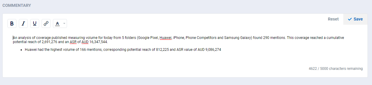
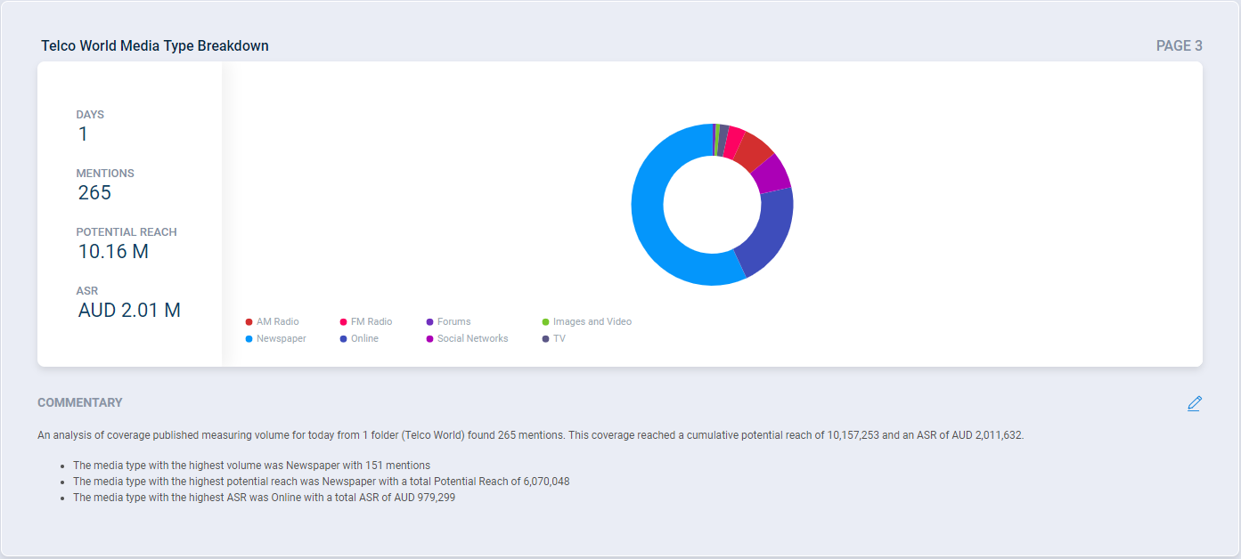
For each chart an automated commentary is created that will include a summary of what is being analysed. This commentary will appear below your chart in the report of the commentary checkbox is ticked.
IF you would like to customise the commentary, you can select the pencil icon to make edits.
Once you are happy with the build options for your report, click the export to PDF button at the top right corner of the screen. This will open a new tab where the report will be built.
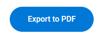
If a new tab doesn’t open, check that your pop-up blocker is allowing Mediaportal to open new pages. If not, you will usually see a red icon appear in the far right-hand side of your URL search bar.
Depending on the size of your report, it may take up-to a few minutes for it to be built. You can track it’s build progress in the new tab that opened. Once your report is finished being built a link will appear that you can select to download the PDF.
While the report is being built you can continue working on the Mediaportal in another tab. This will not effect your report being built.
Once built, your report should: include a cover page

Your chart
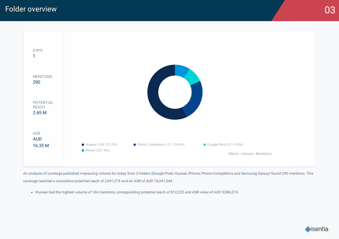
And, if selected, media items that are being analysed in the chart.
Exporting a chart
Using the ellipses actions, each chart can also be downloaded individually in to CSV, PNG or SVG formats.
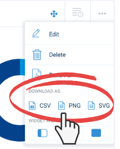
Clicking on the CSV format will download an excel document containing the totals (Volume or Potential reach) for each one of the sections in your chart.
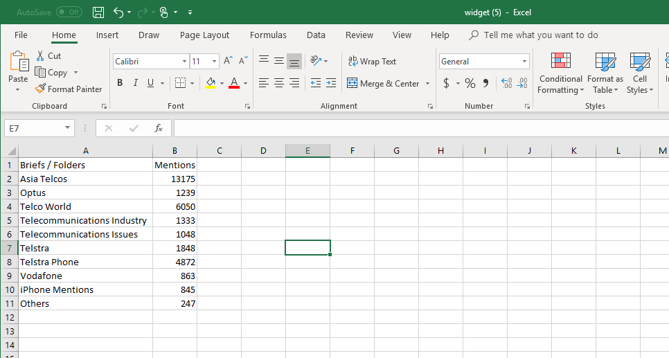
Clicking on the PNG button will download the chart as a PNG image to your desktop. This is particularly useful for adding charts into other reporting documents such as word, or a Power Point presentations.
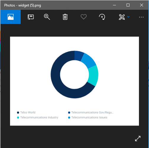
Clicking on the SVG button will download the chart as Scalable Vector Graphic. For those who are unfamiliar with this format, SVG is an XML-based vector image that can scale any size to fit web pages. Unlike JPG or PNG, it does not consist of a fixed set of dots, but a description of shapes and their attributes, so it can be saved as the smallest size possible.
Changing the chart width
The last action in the list is the option to change the widget width. The widget width refers to how wide a chart will appear on the dashboard.
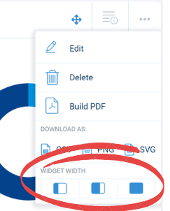
There are three width options available to choose from: 1 tile, 2 tiles or 3 tiles (full row).
You can also change the order that charts appear on your Dashboard by clicking anywhere on a chart and dragging it to another location. 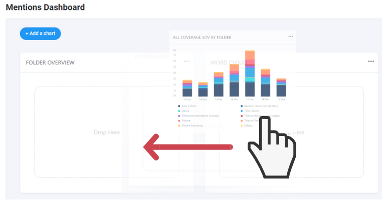
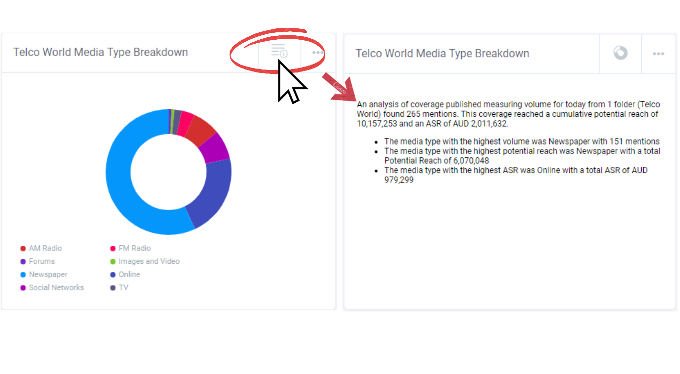
Automated Commentary
All charts on your dashboard will include an automated text commentary to explain key insights and data points that the chart displays. View this commentary by clicking on the icon next to the ellipses on the chart.
Automated commentary can be edited in the report builder for your report outputs. Check out the next section to see how.
Dashboard Reports
Share your analytics with stakeholders via a customisable Analytics Report built right inside Mediaportal. Share your report as an email, URL link or PDF. Start building your report using the hit “Build report” button at the top left of the page.
Reports can be generated for each Dashboard (including up to 9 charts, per dashboard).
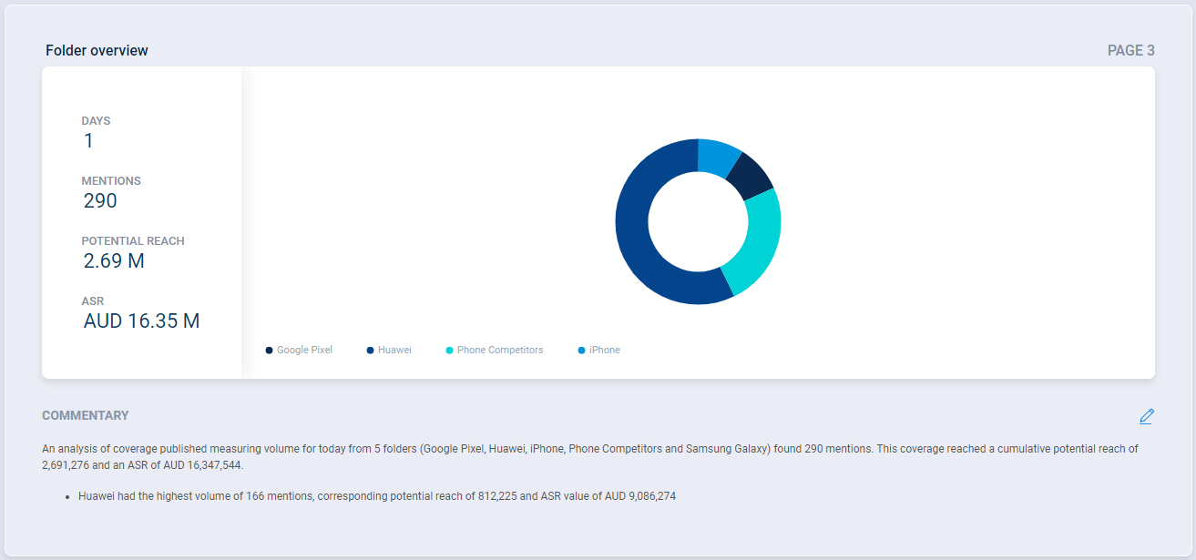
This will take you through to the Dashboard report builder window where all of the charts that were on your Dashboard will appear. The data in the charts will match the settings (date, data set, title) that you had selected on your Dashboard page.
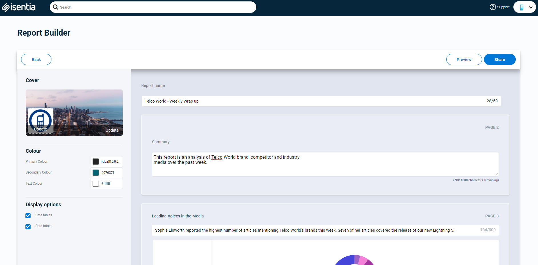
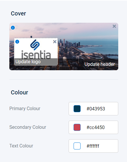
Start customising your report by adding a logo and a header image. Click on the Update or Upload buttons to add images, or drag and drop images here.
![]()
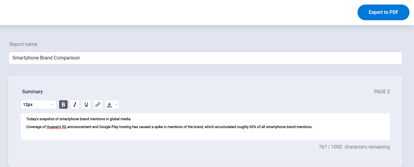
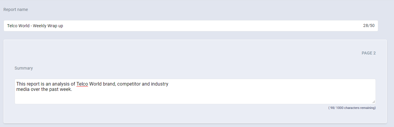
Add a title to your report using the Report name field. You can also add a summary to include some extra detail.
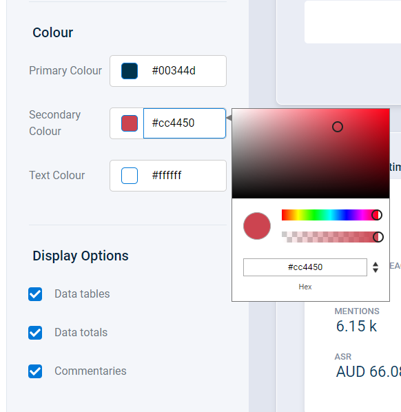
Choose your primary, secondary and text colours. These will be use as the theme throughout your report. Here you can add hexcodes or RGB codes of your brand colours, or choose a colour from the colour palette. You can also set the transparency for the colour banner on your cover page.
Use the display option check boxes to include data totals, automated commentary and/or full data tables for each of your charts in the report.
Automated commentary will appear below each chart in the report to show key insights.
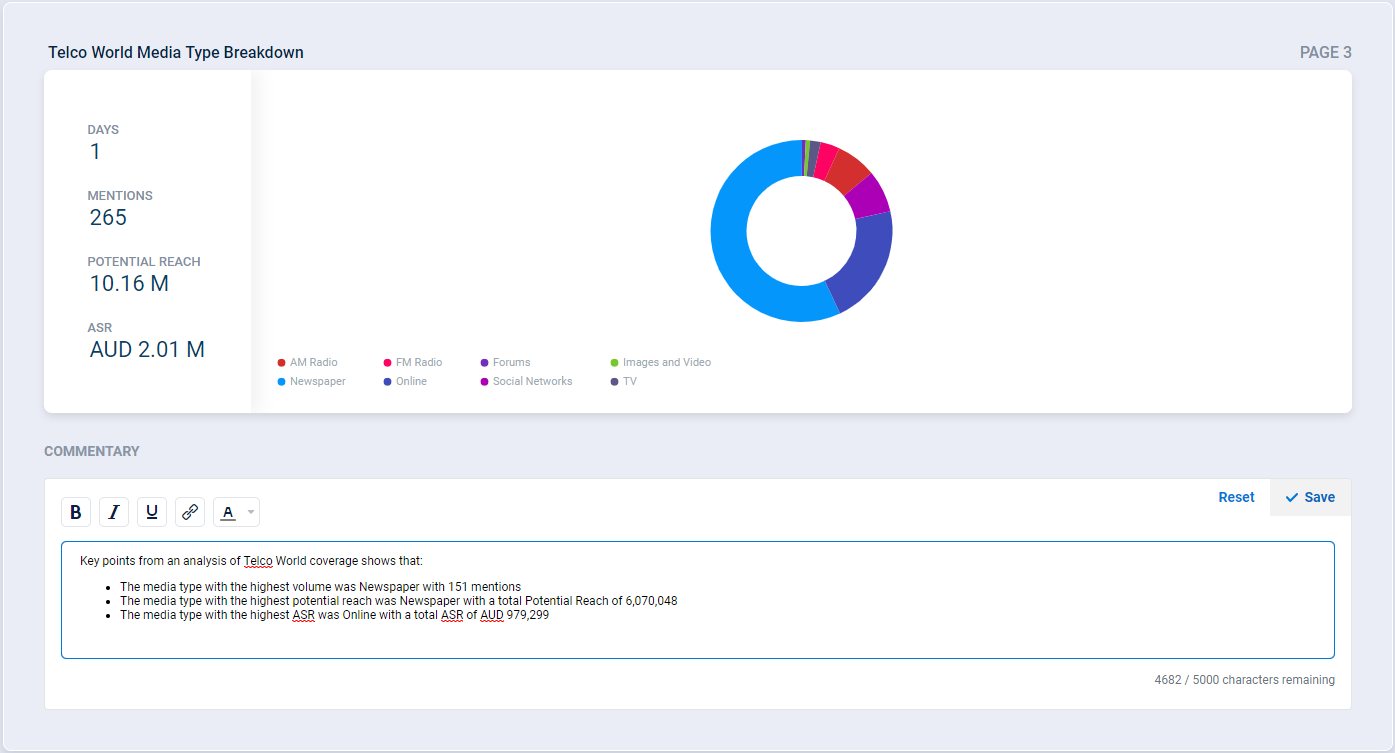
Edit and customise the commentary using the pencil icon to the right of the text, then type in the text box and format your commentary using the formatting tools.
Want to see how you report looks before sharing it? Use the Preview button on the top right of the page to seen what you have created.
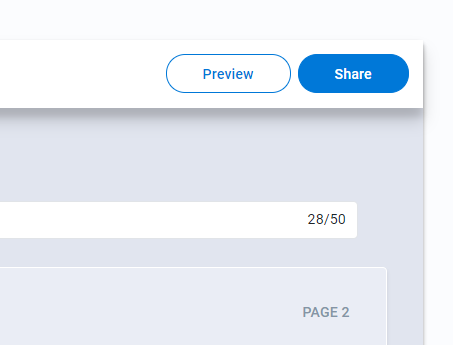
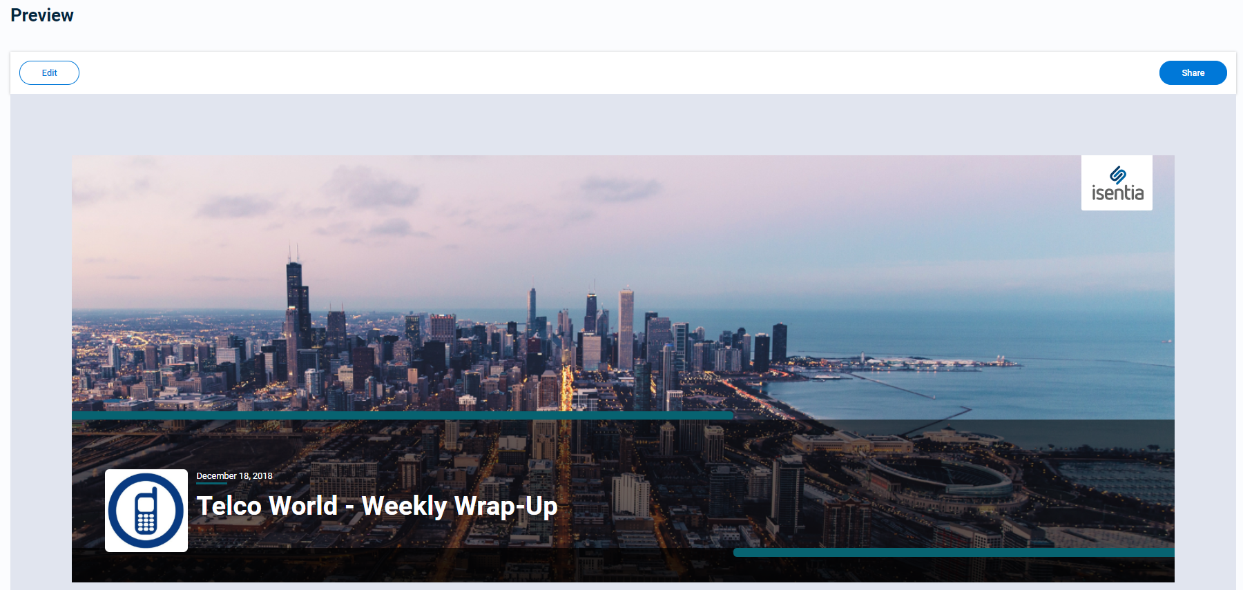
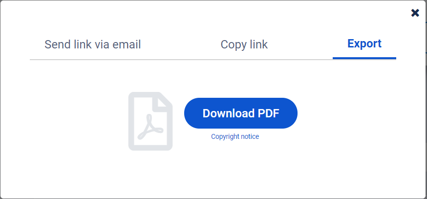
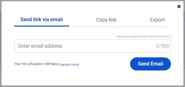
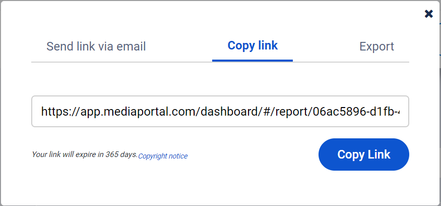
Once you are happy with the report, click the share button at the top right of the preview or report builder page. This will open a window with three format options: Send link via email, Copy link and Export. Use the send link via email option to share the report directly from Mediaportal. Recipients of the email will receive a link to the report and a message notifying them who shared it. A Mediaportal login is not required to access the report.
For more flexibility with sharing your report, use the copy link option. This makes your report accessible in a URL link allowing you to share it anyway you like. These report links will be active for 12 months, and do not require a Mediaportal login to access. Check out this sample web hosted report to see how it works.
The export option allows you to download the report to your desktop as a PDF. Simply click on the blue “Download PDF” button.